
Posted on Jun 8
Loading states are one of those things that every Flutter app needs but nobody enjoys building.
You either skip them entirely and show a blank screen while data loads, or you spend time building a shimmer layout that mirrors your real UI — and then maintain both forever.
There's a third option that most developers don't know about yet.
The standard approach and why it breaks down
The typical Flutter shimmer setup looks like this:
- Build your real screen
- Build a separate shimmer screen that matches the layout
- Toggle between them with a boolean
- Repeat for every screen in the app
This works fine for one screen. For ten screens it becomes a maintenance problem. Every time a designer changes a card layout, you update two files. Miss one, and you ship a shimmer that no longer matches the real content.
A better way: auto_shimmer_animate
auto_shimmer_animate takes a different approach. Instead of you building the skeleton, the package generates it from your existing widget tree.
You wrap your real widget, pass isLoading, and it handles the rest.
dependencies:
  auto_shimmer_animate: ^0.2.1
import 'package:auto_shimmer_animate/auto_shimmer_animate.dart';
Basic implementation
Widget build(BuildContext context) {
  return AutoShimmerAnimate(
    isLoading: isLoading,
    child: const ProductCard(),
  );
}
When isLoading is true, the skeleton renders. When it's false, the real ProductCard shows up. Same widget, zero duplication.
Handling lists
Lists need placeholder data while loading so the skeleton has a shape to render:
final visibleItems = isLoading
    ? List.filled(5, Product.placeholder())
    : products;

return AutoShimmerAnimate(
  isLoading: isLoading,
  child: ProductList(products: visibleItems),
);
Keep the placeholder count close to the expected item count so the skeleton looks natural.
Choosing a shimmer effect
Four effects ship with the package. Each fits a different context.
Sweep — classic left-to-right shimmer, works everywhere:
AutoShimmerAnimate(
  isLoading: isLoading,
  effect: const AutoShimmerSweepEffect(
    highlightOpacity: 0.62,
    duration: Duration(milliseconds: 1600),
  ),
  child: const ProductCard(),
)
Aurora — soft multi-color shimmer, good for image-heavy screens:
AutoShimmerAnimate(
  isLoading: isLoading,
  effect: const AutoShimmerAuroraEffect(),
  child: const ProductCard(),
)
Pulse — low-motion fade, better for accessibility or minimal UIs:
AutoShimmerAnimate(
  isLoading: isLoading,
  effect: const AutoShimmerPulseEffect(),
  child: const ProductCard(),
)
Raw — full gradient control for brand-specific loading animations:
AutoShimmerAnimate(
  isLoading: isLoading,
  effect: const AutoShimmerRawEffect(
    colors: [
      Colors.transparent,
      Color(0x26FFFFFF),
      Color(0xCCFFFFFF),
      Color(0x26FFFFFF),
      Colors.transparent,
    ],
    stops: [0, 0.25, 0.48, 0.72, 1],
    duration: Duration(milliseconds: 1700),
  ),
  child: const ProductCard(),
)
Custom skeleton colors
The package uses adaptive theme colors by default. Override them when your screen has a specific color palette:
AutoShimmerAnimate(
  isLoading: isLoading,
  baseColor: Colors.indigo.shade100,
  childBaseColor: Colors.indigo.shade200,
  highlightColor: Colors.white,
  child: const ProductCard(),
)
baseColor applies to parent containers. childBaseColor applies to nested elements like text blocks and image placeholders. The two-layer contrast makes the skeleton look more realistic.
Using enums instead of booleans
If your screen state is an enum or object rather than a plain bool, use AutoShimmerStateAnimate:
enum ViewStatus { initial, loading, loaded }

AutoShimmerStateAnimate<ViewStatus>(
  state: status,
  loadingStates: const [
    ViewStatus.initial,
    ViewStatus.loading,
  ],
  child: const ProductCard(),
)
No extra boolean flag needed. The loading state stays tied directly to your state machine.
Controlling what gets skeletonized
Sometimes you want parts of the widget tree to stay visible during loading. Three flags handle this:
// Keep network images visible instead of replacing them with grey blocks
AutoShimmerAnimate(
  isLoading: isLoading,
  ignoreImages: true,
  child: const ProductCard(),
)

// Keep text and containers visible
AutoShimmerAnimate(
  isLoading: isLoading,
  ignoreTexts: true,
  ignoreContainers: true,
  child: const ProductCard(),
)
App-wide defaults with AutoShimmerTheme
If you want consistent shimmer behavior across your entire app, set defaults once with AutoShimmerTheme:
AutoShimmerTheme(
  data: AutoShimmerConfig(
    baseColor: Colors.grey.shade200,
    childBaseColor: Colors.grey.shade300,
    highlightColor: Colors.white,
    duration: const Duration(seconds: 2),
  ),
  child: const MyApp(),
)
Individual AutoShimmerAnimate widgets can still override these when needed.
Quick parameter reference
isLoading — bool, required. Shows skeleton when true.
child — Widget, required. The widget tree to skeletonize.
baseColor — Color?. Parent surface skeleton color.
childBaseColor — Color?. Content/child skeleton color.
highlightColor — Color?. Sweep highlight color (default: white).
highlightOpacity — double?. Highlight opacity (default: 0.45).
highlightWidth — double?. Highlight band width (default: 0.2).
effect — AutoShimmerEffect?. Sweep, Aurora, Pulse, or Raw.
duration — Duration?. Sweep cycle duration (default: 3s).
repeatDelay — Duration?. Pause between sweeps (default: 0ms).
direction — AutoShimmerDirection?. Sweep direction (default: diagonal).
borderRadius — BorderRadius?. Corner radius of skeletons (default: 8px).
enabled — bool?. Disable animation for a static skeleton.
layeredSkeleton — bool?. Separate colors for parent and child layers.
blockChildShimmer — bool?. Paint parent blocks behind child skeletons.
onlyChildShimmer — bool?. Paint only leaf-level skeletons.
ignoreContainers — bool. Keep containers unchanged.
ignoreImages — bool. Keep images visible.
ignoreTexts — bool. Keep text visible.
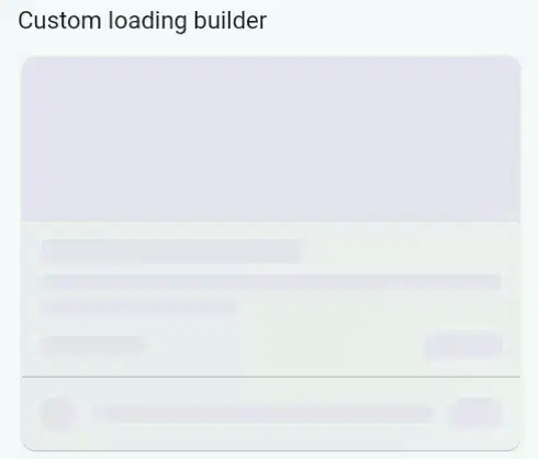
loadingBuilder — builder?. Fully custom loading widget.
shimmerBuilder — builder?. Custom shimmer animation wrapper.
When does this approach make sense?
If you're building a screen with a single loading state that you'll never touch again, the manual approach is fine. But if you're working on a product that gets updated regularly, screens that get redesigned, or a team where multiple people maintain the UI the auto-generation approach saves real time.
The shimmer stays in sync because it's derived from the real layout. There's nothing to forget to update.
Links
- pub.dev: https://pub.dev/packages/auto_shimmer_animate
- GitHub: https://github.com/kartikhadiya09/auto_shimmer_animate
- Website: https://hadiyakartik.online
Stars and likes help a lot for a solo maintained package. If you try it out and run into anything, open an issue on GitHub.
Top comments (0)
For further actions, you may consider blocking this person and/or reporting abuse